The main product search results page on InTouch has a fresh new look that makes it even easier to make your purchasing decisions
Over 120,000 users across the channel log in to InTouch every month. This is testament to the fact that TD SYNNEX’s customers find InTouch so useful to their business that they log in every day. With such a large and loyal group of users, any changes TD SYNNEX make to the website must be carefully considered, to ensure customer experience is only improved with each change.

One of the most common functions Resellers use on InTouch is the product search; in order to build a quote or make a purchasing decision. Now the search results pages have been updated with a fresh new look that present the same information in a cleaner and clearer way.
The way those results are presented is important because that influences how easy your life gets from that point on. Over time we’ve continued to improve the website features, keeping the look and feel the same. The search result page now has far more functionality and features than when it launched and the e-Business team recently decided to take a fresh look at its layout and presentation.
The result of that review is a results page that has a completely new and clean look.
When searching on InTouch now, you are presented with a set of results that is more open and easier to read. The new page is wider, so it looks better on screen and can take advantage of today’s higher resolution displays.
This means that all the great features you love are easier than ever to find and use.
Such as...
Less is more

The layout is simpler and there are not so many graphics and navigation elements on the screen, so it looks very neat and tidy. The colour scheme has also been changed to provide a cleaner look, with promotions and banners displayed outside this area.
In addition, you may notice that some of the icons have changed and we’ve now standardised on a simple green stripe with white text to flag-up when a product is on offer, is part of a bundled offer or further discounts may be available.

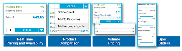
Another change sees stock and price information separated from the more general product details, along with available volume price breaks. From this point you can choose to compare products if you haven’t made up your mind. If you want to select products to compare side by side, you do this from the small pull-down menu which can be accessed via the Order button (blue background) on the right.
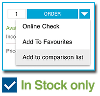
This is also where you’ll find the‚ ‘Online Check’ and ‘Add To Favourites‘ options. At the top of the page, the ‘In stock only’ button meanwhile, has moved across to the left. At the top of the page there is now the option to sort products by most popular which gives a great insight into what’s selling in the channel. Here you can also choose to switch to slimline view should you wish to reduce the image sizes and amount of text in order to see more products at once.
Cathi Low, SMB Sales Director at TD SYNNEX, said: ‘We think the changes are going to make a big difference to customers. The results are now much clearer and easier to read. It’s immediately obvious when you do a search that the presentation is different, and while some of the changes are quite subtle, all the same functionality is still there. You can still see when there are offers or a product is a best-seller, and compare products side-by-side, for example. But it looks much better. It’s a page that everyone uses, so in that sense it is one of the biggest and most important changes we’ve made to InTouch for some time.’
Learn about InTouch
If you have any questions or feedback on the new pages, please contact your account manager on 01256 788 000.